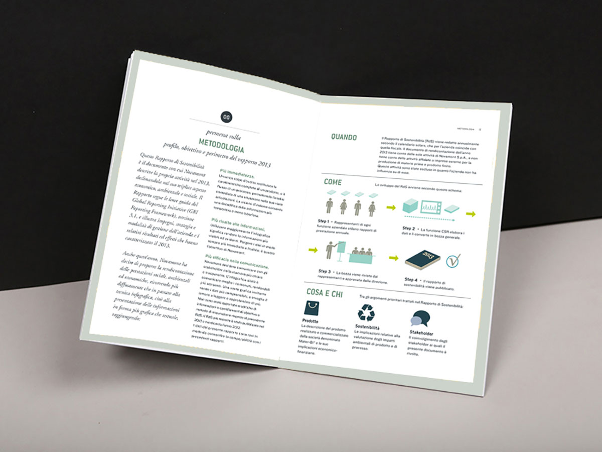
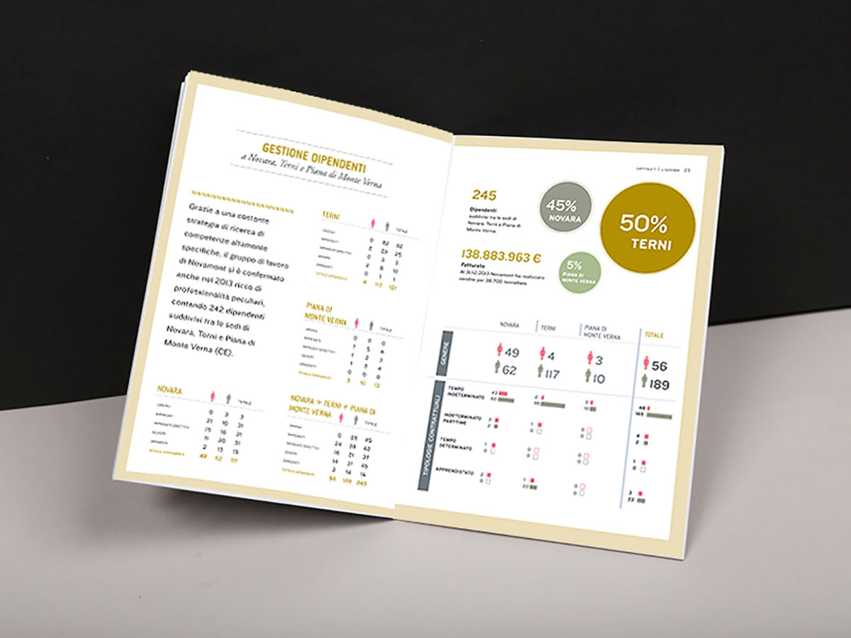
Corporate Responsability Report 2013 – We used a multicolor palette (with pastel shades) and transparency.
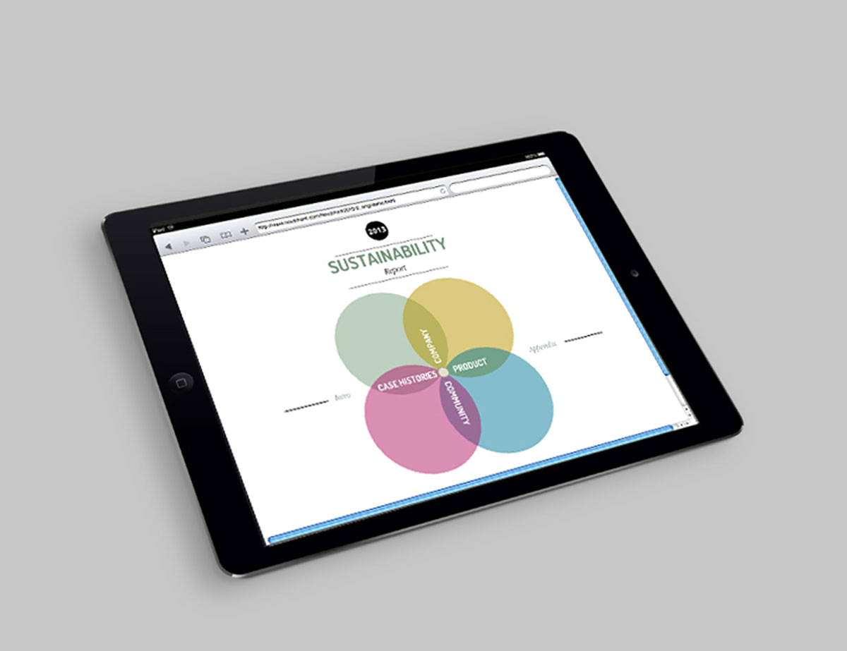
Multicolor intentionally recall the Expo Milano 2015 (the report has been published in december 2014), and in the same time helps to indentify the 4 main sections and navigate easier the content. Color shades are soft and dusty pastels, the palette is inspired by the 50’s.
Transparency allude to transparency and clarity of the management. And enfasise how the 4 areas of content (company, product, community, case histories) are deeply connected.
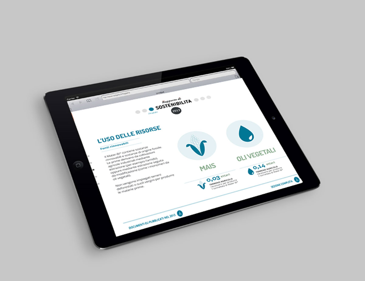
The new interactive version of the report is fully responsive, and easier to navigate.


